We live in a digital world with finite screen sizes. Some people prefer to overfill the white space or empty space or negative space to achieve maximum value, but they should be aware of the purpose of the white space and its aesthetic value. The correct use of white space is important, or else the design would appear amateurish and uninteresting.
White Space In Interaction Design
White space in interaction design is the blank or unused space between and surrounding the design elements on the page or page layout; between lines and paragraphs, images, buttons, icons, and other elements on the page. As a concept, the amount and use of white space vary from purpose to purpose. White space is not always white; it may be any color or pattern, which is why we sometimes refer to it as negative space.
Unfortunately, many a time, clients don’t appreciate white space as they consider it as wasted space and want a lot of content to be squeezed in. However, a skilled web and mobile app development company in Northampton, UK knows that white space adds elegance and is important to offer a quality user experience.
Types Of White Space
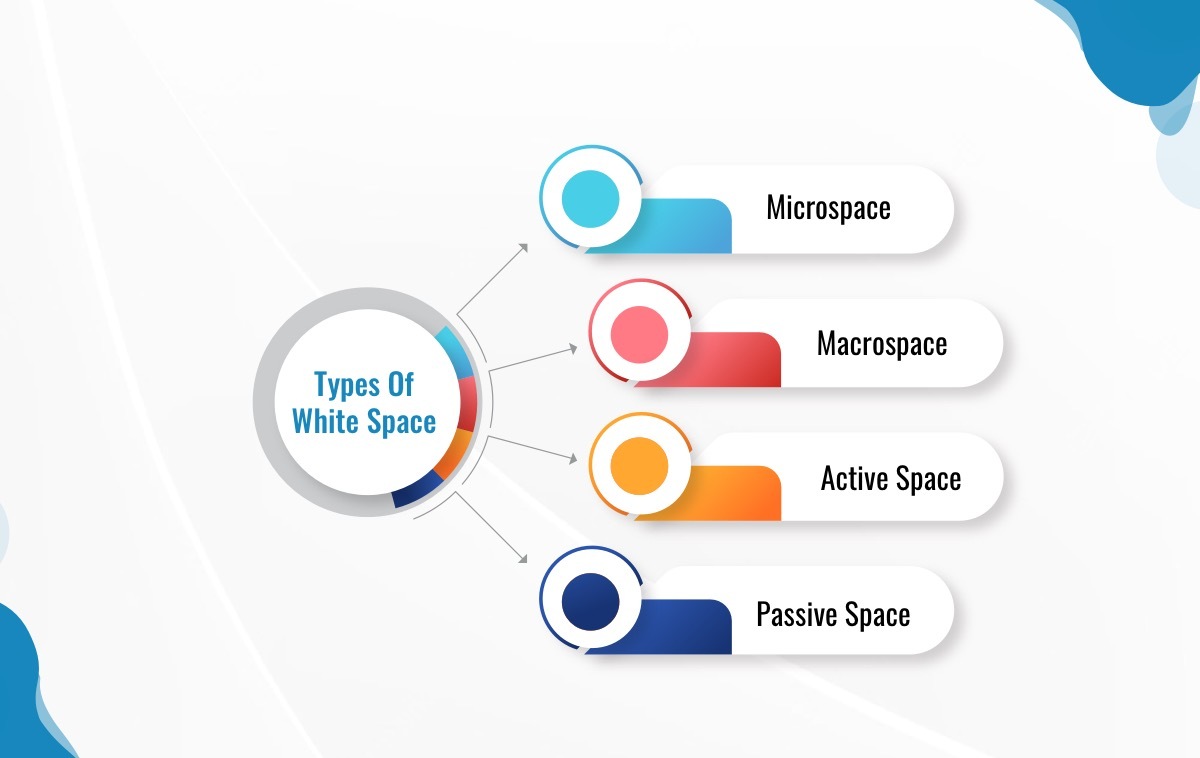
Microspace
There should be space between tiny elements such as characters, lines, icons, sections, buttons, and graphics. Fine-tuning the amount of space between the tiniest elements will allow you to express more effectively and make the content more obvious, which will boost the overall design and avoid clutter.
Macrospace
Macrospace refers to the space used for margins and paddings and also the space provided between larger elements such as text columns and graphical elements. This space divides and organizes elements and provides visual cues of functioning and also improves legibility.

Active Space
The term “active” refers to the purposeful positioning of the space itself to highlight a certain design element or part of the page layout. Active white space draws the user’s attention to content and is used to control the flow of information, content layout, and general navigation.
Passive Space
Passive white space is entirely cosmetic and basically exists to enhance the appearance of content. In a written document, for example, passive white space would comprise the gaps between characters, line spacing, and margins.
Importance Of White Space In Usability And User Interface
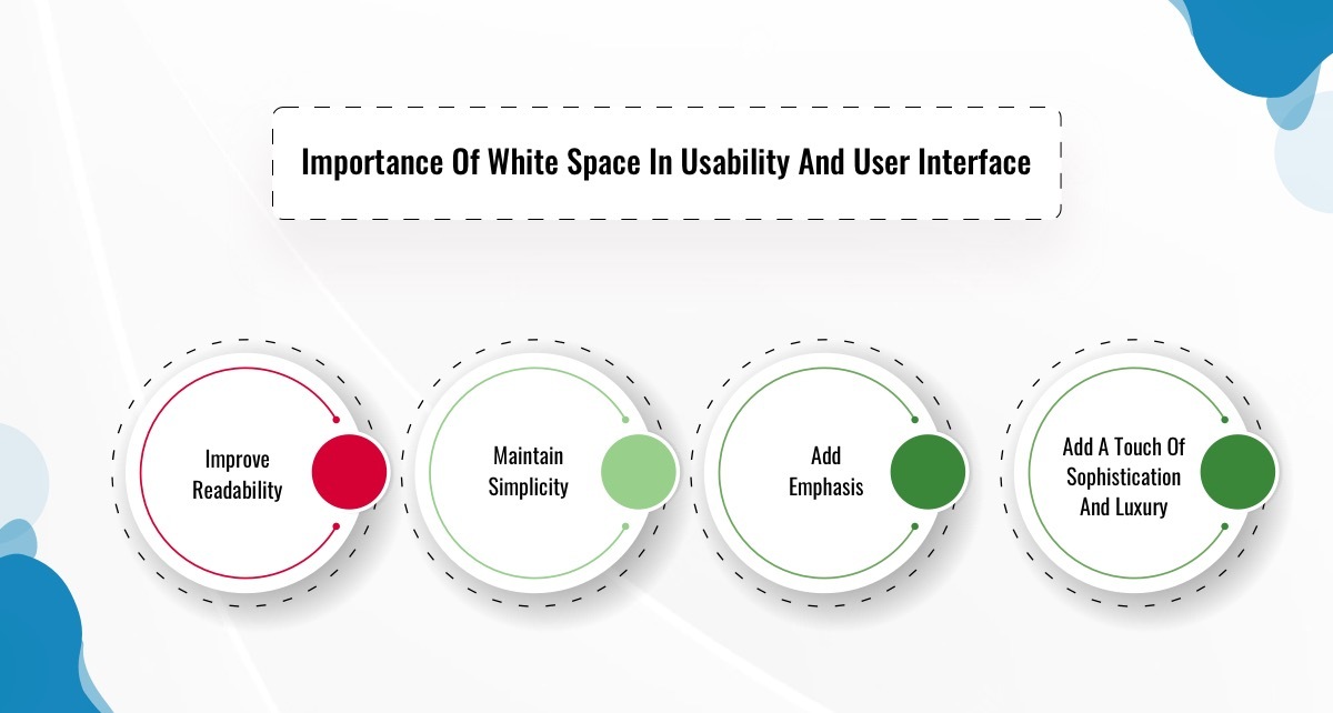
The value of white space extends well beyond aesthetics and can be intelligently utilized to further boost business goals and increase engagement.
Improve Readability
If your design is cluttered, it will be tough to read and will draw the reader’s attention away from your content. Macro white space guarantees that your content is easy to read and understand whereas micro white space guarantees that your content does not clash with other elements.
Maintain Simplicity
White space divides your design components into separate portions, preventing your reader’s eye from being overburdened. This allows people to comprehend the information you’re delivering more easily.
Add Emphasis
The negative space provides visual cues about where you should concentrate, as well as enough buffer area surrounding a component so that your brain can understand it promptly. Users should not be overwhelmed by a massive amount of text. If the white space is insufficient, it will appear hard to grasp, resulting in a greater risk of abandonment of the website or application. A sufficient amount of white space, on the other hand, will avoid this problem.
Add A Touch Of Sophistication And Luxury
Using a “less is more” attitude and adding more white space can give the impression of luxury or class. Consider graphic design to be similar to fine dining. Your plate may appear empty, but the minimal presentation works to accentuate the dish’s uniqueness.
Final Word
In terms of design, white space is an indispensable tool. Whitespace can be difficult to get right: its use is both a science and an art. Knowing how much whitespace to utilize to produce an impressive layout requires a lot of practice.
Do you need your UI designs to stand out?
Get in touch with web and mobile app designers in Northampton, UK!
Experienced designers at Zimble Code know that although white space has nothing but ‘Nothing Matters’ a lot. To learn more, reach out to us.






Leave A Comment